How to Create a React App with Storybook
UI designers and front-end developers are tasked with creating clean and consistent user interfaces. At the same time, testing is a cornerstone of software development. Each part of a software project is tested individually and isolated from the other elements in unit tests. This practice has been challenging to achieve in the context of user interfaces.
Now Storybook provides an open-source framework that lets you test UI components in isolation from the rest of the website. Storybook presents you with a browser of all the components in your web application. You can test each component independently and in different configurations. The tool runs as a separate application outside your main application, which means that you can test your components without worrying about application-specific dependencies or requirements.
In this tutorial, I will show you how to use Storybook to create a simple React application. The application will be a unit conversion app, and I will use Storybook to showcase the individual components and the application page itself. I will not assume any prior knowledge of React or Storybook. I will assume that you are familiar with JavaScript and Node, and have an up-to-date version of the npm packet manager installed on your computer.
Creating React components with Storybook
In this section, I will show you how to create a React application and implement components displayed in Storybook. These components will serve as the basis for the unit conversion application. To start, open a terminal in a folder of your choice and run the following command to create a new React application.
npx create-react-app react-storybook
The create-react-app the command creates a new folder, react-storybook, and initializes a basic application skeleton. Next, turn this basic React app into a Storybook application. Navigate into the newly created folder and run the following command.
npx sb init
When prompted, answer yes to install the sb package. Initializing Storybook will create a new folder, stories inside the src folder, and populate it with some pre-made demo components and stories to be used by Storybook. Open the project folder in your favorite IDE.
You can test out the storybook straight away. Open a terminal session in the project folder and run the following command.
npm run storybook
The command runs the Storybook app and opens a browser tab (http://localhost:6006). For now, you will only see the components that Storybook installs by default. You can keep Storybook running while you develop your app.
Using your IDE, create a new file named src/stories/Components.jsx. This will be the module that will contain some basic UI components. For the sake of this tutorial, I will place all these components into a single module. In practice, you might want to spread them out over several files. Open src/stories/Components.jsx and paste in the following code.
import React, { useState } from 'react';
import PropTypes from 'prop-types';
import './Components.css';

export function Input({ size, type, label, name, placeholder, onChange }) {
  return (
    <label className={`input-component input-component--${size}`}>
      <span>{label}</span>
      <input
        type={type==='text' ? 'text' : 'number'}
        step={type==='floating-point' ? 'any' : undefined}
        name={name}
        placeholder={placeholder}
        onChange={onChange}
      />
    </label>
  );
};

Input.propTypes = {
  size: PropTypes.oneOf(['medium', 'large']),
  type: PropTypes.oneOf(['text', 'number', 'floating-point']),
  label: PropTypes.string.isRequired,
  name: PropTypes.string.isRequired,
  placeholder: PropTypes.string.isRequired,
  onChange: PropTypes.func,
};

Input.defaultProps = {
  size: 'medium',
  type: 'text',
  label: 'Enter a value',
  name: 'input',
  placeholder: 'Please enter a value',
  onChange: undefined
};

export function Select({ size, label, options, onChange }) {
  return (
    <label className={`select-component select-component--${size}`}>
      <span>{label}</span>
      <select className="select-component" onChange={onChange}>
        {options.map((option) => <option value={option.value}>{option.description}</option>)}
      </select>
    </label>
  );
};

Select.propTypes = {
  size: PropTypes.oneOf(['medium', 'large']),
  label: PropTypes.string.isRequired,
  options: PropTypes.arrayOf(PropTypes.shape({
    value: PropTypes.string.isRequired,
    description: PropTypes.string.isRequired
  })).isRequired,
  onChange: PropTypes.func,
};

Select.defaultProps = {
  size: 'medium',
  label: 'Options',
  options: []
};

export function Tabs({ children }) {
  const [active, setActive] = useState(0);

  const onTabClick = (newActive) => () => {
    setActive(() => newActive);
  };

  return (
    <div className="tabs-component">
      <div className="tabs-row">
        {children.map((child, index) => <div className={`tab ${index === active ? "active" : ""}`} onClick={onTabClick(index)}>{child.props.label}</div>)}
      </div>
      <div className="tabs-content">
        {children[active]}
      </div>
    </div>
  );
};

Tabs.propTypes = {
  children: PropTypes.instanceOf(Array).isRequired,
};

Tabs.defaultProps = {
  children: []
};
This module exports three components. Input is a configurable <input> element with a label for entering text or numbers, Select is a dropdown <select> element wrapped in a label, and Tabs is a component that shows its children in a separate tab. I am using the React feature propTypes to specify the properties that each React component expects as arguments, allowing Storybook to extract this meta-information and display it to the user. To provide a bit of styling for the components, create a file src/stories/Components.css, and fill it with the following contents.
.input-component {
  display: flex;
  flex-direction: column;
  margin-bottom: 1rem;
}

.input-component span {
  display: block;
  margin-bottom: 0.5rem;
}

.input-component.input-component--large input {
  font-size: 1.2rem;
  padding: 0.5rem 1rem;
}

.select-component {
  display: flex;
  flex-direction: column;
  margin-bottom: 1rem;
}

.select-component span {
  display: block;
  margin-bottom: 0.5rem;
}

.select-component.select-component--large select {
  font-size: 1.2rem;
  padding: 0.5rem 1rem;
}

.tabs-component .tabs-row {
  font-family: 'Nunito Sans', 'Helvetica Neue', Helvetica, Arial, sans-serif;
  display: flex;
}

.tabs-component .tabs-row .tab {
  border: 1px solid #EEEEEE;
  border-bottom: none;
  border-top-right-radius: 4px;
  border-top-left-radius: 4px;
  padding: 0.5rem 1rem;
  cursor: pointer;
}

.tabs-component .tabs-row .tab.active {
  background-color: #EEEEEE;
  cursor: auto;
}

.tabs-component .tabs-content {
  border: 1px solid #EEEEEE;
  padding: 0.5rem 1rem;
}
With this, the components are usable as React components in your application. But you also want them to be browsable through Storybook. For this, you will need to create one file for each component. Start by creating a file src/stories/Input.stories.jsx and enter the following code in it.
import React from 'react';

import { Input } from './Components';

export default {
  title: 'Components/Input',
  component: Input,
};

const Template = (args) => <Input {...args} />;

export const Normal = Template.bind({});

Normal.args = {
  label: 'Normal Input',
  placeholder: 'Enter your value',
  size: 'normal'
};

export const Large = Template.bind({});

Large.args = {
  label: 'Large Input',
  placeholder: 'Enter your value',
  size: 'large'
};

export const Number = Template.bind({});

Number.args = {
  label: 'Integer Number',
  placeholder: 'Enter your value',
  size: 'large',
  type: 'number'
};

export const FloatingPoint = Template.bind({});

FloatingPoint.args = {
  label: 'Floating Point Number',
  placeholder: 'Enter your value',
  size: 'large',
  type: 'floating-point'
};
The export default at the top of the file tells Storybook what the component’s name is and which React component the stories in this file refer to. The subsequent exports Normal, Large, Number, and FloatingPoint represent individual stories or use cases for that component. Each story defines a member args that specifies the properties to pass to the component. Creating stories in this way is quick, so now create the next one for the Select component. Create a file src/stories/Select.stories.jsx and paste the following contents into it.
import React from 'react';

import { Select } from './Components';

export default {
  title: 'Components/Select',
  component: Select,
};

const Template = (args) => <Select {...args} />;

export const Default = Template.bind({});

Default.args = {
  size: 'medium',
  label: 'Select an Option',
  options: [
    { value: 'a', description: 'Option A' },
    { value: 'b', description: 'Option B' },
    { value: 'c', description: 'Option C' },
  ]
};

export const Large = Template.bind({});

Large.args = {
  size: 'large',
  label: 'Select an Option',
  options: [
    { value: 'a', description: 'Option A' },
    { value: 'b', description: 'Option B' },
    { value: 'c', description: 'Option C' },
  ]
};
This file defines two stories for the Select component. One story shows it in normal size, and the other shows it in a large size. Finally, do the same for the Tabs component. Create a file src/stories/Tabs.stories.jsx and fill it with the contents below.
import React from 'react';

import { Tabs } from './Components';

export default {
  title: 'Components/Tabs',
  component: Tabs,
};

const Template = (args) => <Tabs {...args} />;

export const Default = Template.bind({});

Default.args = {
  children: [
    <div label="One">Content One</div>,
    <div label="Two">Content Two</div>,
    <div label="Three">Content Three</div>,
  ]
};
Now, you are ready to test out your new components in Storybook. If you haven’t done so already, open the terminal in the project folder and run the following command.
npm run storybook
The command runs the Storybook app and opens a browser tab (http://localhost:6006). You can browse the components in the left sidebar. The stories you just created can be found under the Components header, and when you select, for example, the Input -> Number story, you should see something like shown in the image below.
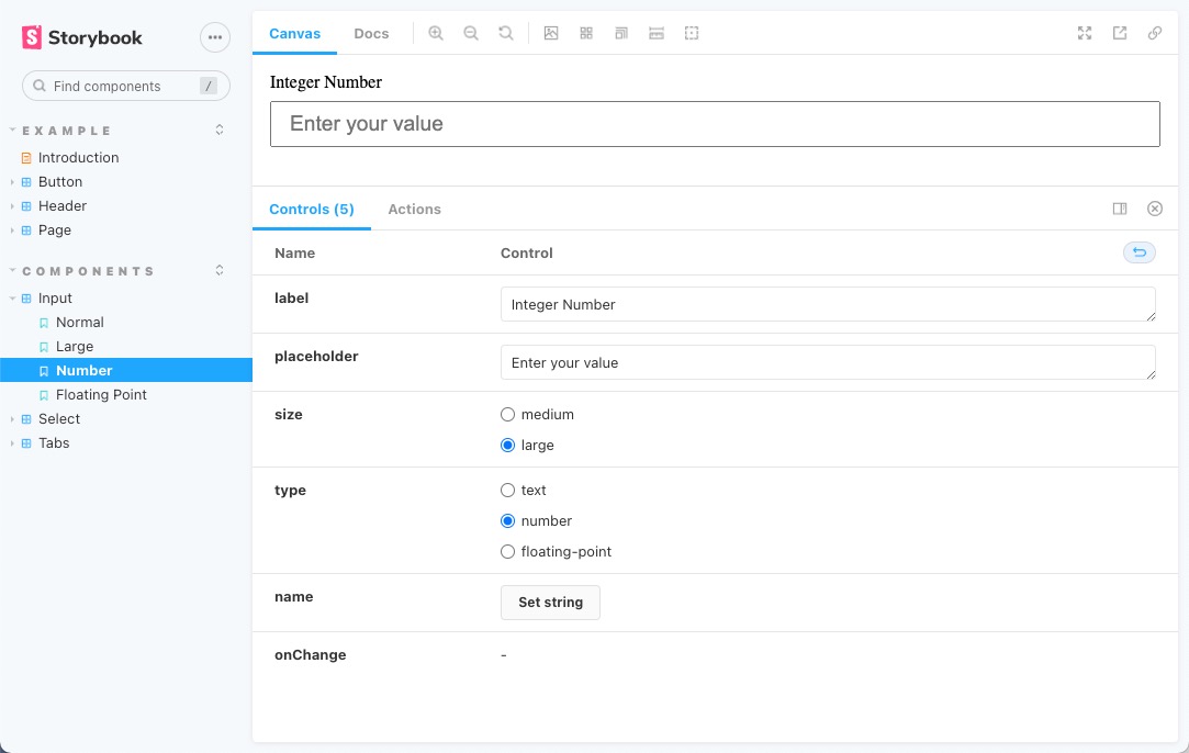
The component shows up in the main view, and the icons above let you change the background, and the screen size, and even allow you to check the dimensions of the component’s layout. Below the main view, you can manually adjust the options passed to the component. I invite you to play around with all the features Storybook provides.


Comments
Post a Comment