How to Create a unit converter application using Storybook component stories
I will use the convert-units library to implement the unit conversion app. Open a second terminal in your project folder and run the command below.
npm install -E convert-units@2.3.4
Now, in your IDE, create a new file, src/stories/Converter.jsx, and fill it with the contents below.
import React, { useState } from 'react';
import PropTypes from 'prop-types';
import * as convert from 'convert-units';
import { Input, Select } from './Components';

export const Converter = ({measure}) => {
  const possibilities = convert().possibilities(measure).map((unit) => {
      const descr = convert().describe(unit);
      return {
          value: descr.abbr,
          description: `${descr.singular} (${descr.abbr})`
      };
  });

  const [fromUnit, setFromUnit] = useState(possibilities[0].value);
  const [toUnit, setToUnit] = useState(possibilities[0].value);
  const [fromValue, setFromValue] = useState(1);
  const [toValue, setToValue] = useState(convert(1).from(fromUnit).to(toUnit));

  const updateFromUnit = (event) => {
    setFromUnit(() => event.target.value);
    setToValue(() => convert(fromValue).from(event.target.value).to(toUnit));
  };

  const updateToUnit = (event) => {
    setToUnit(() => event.target.value);
    setToValue(() => convert(fromValue).from(fromUnit).to(event.target.value));
  };

  const updateValue = (event) => {
    setFromValue(() => event.target.value);
    setToValue(() => convert(event.target.value).from(fromUnit).to(toUnit));
  };

  return <div className="converter">
      <Select label="From:" options={possibilities} onChange={updateFromUnit}></Select>
      <Select label="To:" options={possibilities} onChange={updateToUnit}></Select>
      <Input label="Value:" type="floating-point" onChange={updateValue}></Input>
      <p>{fromValue} {fromUnit} = {toValue} {toUnit}</p>
  </div>
};

Converter.propTypes = {
  measure: PropTypes.string.isRequired
};

Input.defaultProps = {
  measure: 'length'
};
The component takes a single property called measure, which specifies the type of units to be converted and can be something like mass or length. The code for this component then consists of four parts. The first action is to query the convert-units library for all the possible unit conversion options. Units are mapped into an array of objects, ready to use with the Select component. In the next part, you’ll define four state properties, followed by three event handlers. These will react to a change in the user input and update the state accordingly. These event handlers contain the actual calls to the convert-units library where the unit conversion happens. Finally, the component is put together from all the parts and returned. You can also create a story for this more complex component with the individual components. Create a file src/stories/Converter.stories.jsx and paste in the following contents.
import React from 'react';
import { Converter } from './Converter';

export default {
  title: 'Components/Converter',
  component: Converter,
};

const Template = (args) => <Converter {...args} />;

export const Default = Template.bind({});

Default.args = {
  measure: 'length'
};

export const Mass = Template.bind({});

Mass.args = {
  measure: 'mass'
};
When you installed Storybook with the npx sb command, the initialization script added a few components as examples to demonstrate Storybook’s capabilities. You will be reusing two of these components for the unit-conversion app. Open src/stories/Header.jsx and replace its contents with the following code.
import React from 'react';
import PropTypes from 'prop-types';
import { Button } from './Button';
import './header.css';

export const Header = ({ user, onLogin, onLogout }) => (
  <header>
    <div className="wrapper">
      <div>
        <h1>Unit Converter</h1>
      </div>
      {user ? <div> Hello {user.given_name} </div> : ""}
      <div>
        {user ? (
          <Button size="small" onClick={onLogout} label="Log out" />
        ) : (
          <>
            <Button size="small" onClick={onLogin} label="Log in" />
          </>
        )}
      </div>
    </div>
  </header>
);

Header.propTypes = {
  user: PropTypes.shape({}),
  onLogin: PropTypes.func.isRequired,
  onLogout: PropTypes.func.isRequired,
  onCreateAccount: PropTypes.func.isRequired,
};

Header.defaultProps = {
  user: null,
};
I have modified the header component to show the correct application name and allow some structured user data to be passed in. In the story for the header, in the file src/stories/Header.stories.jsx, modify the arguments passed to the LoggedIn story to reflect this change.
LoggedIn.args = {
  user: {
    given_name: "Username"
  },
};
Now, open src/stories/Page.jsx and modify its contents to match the code below.
import React from 'react';
import PropTypes from 'prop-types';
import { Header } from './Header';
import './page.css';
import { Tabs } from './Components';
import { Converter } from './Converter';

export const Page = ({useAuth}) => {
  const [user, login, logout] = useAuth();
  return <article>
    <Header user={user} onLogin={login} onLogout={logout} />
    <section>
      <Tabs>
        <Converter measure="length" label="Length" key="length"></Converter>
        <Converter measure="mass" label="Mass" key="mass"></Converter>
        <Converter measure="volume" label="Volume" key="volume"></Converter>
      </Tabs>
    </section>
  </article>;
}

Page.propTypes = {
  useAuth: PropTypes.func.isRequired
};

Page.defaultProps = {
};
This component displays the application page, including the header and a tabbed container that allows switching between Converter components configured to convert different measures. The page needs a useAuth hook passed in that returns the user information and callbacks to log the user in or out. In the stories for the page, in, you need to create a mock function that supplies fake user data. Edit the contents of this file to look like the following code.
import React from 'react';
import { Page } from './Page';

export default {
  title: 'Pages/Page',
  component: Page,
};

const mockUseAuth = (loggedIn) => () => [
  loggedIn ? {given_name: "Username"} : undefined,
  () => {},
  () => {}
];

const Template = (args) => <Page useAuth={mockUseAuth(true)} {...args}/>;

export const LoggedIn = Template.bind({});
LoggedIn.args = {
  useAuth: mockUseAuth(true),
};

LoggedIn.parameters = {
  controls: { hideNoControlsWarning: true },
};

export const LoggedOut = Template.bind({});
LoggedOut.args = {
  useAuth: mockUseAuth(false),
};

LoggedOut.parameters = {
  controls: { hideNoControlsWarning: true },
};
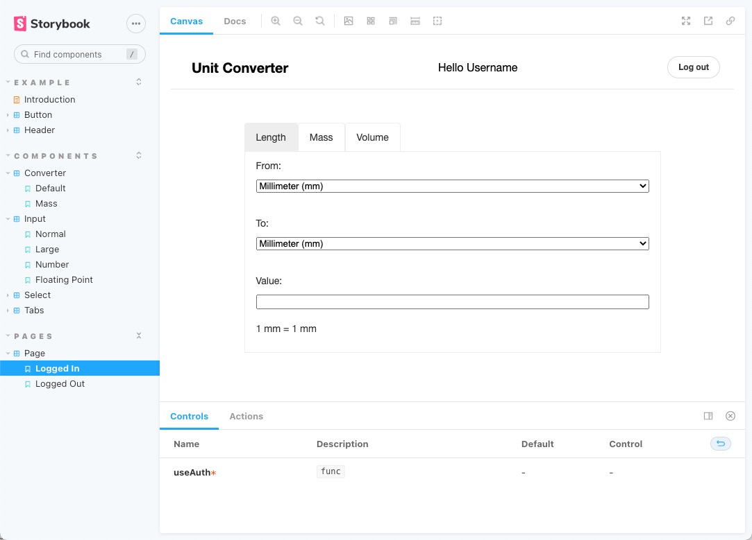
Note how mockUseAuth uses currying to return a function that can be used as the useAuth hook in the Page component. You can now use Storybook again to test the Converter component and the full application page. If it’s not still running, run npm run storybook again. You can navigate to Pages -> Page in the left sidebar, and you should see something like the image below.


Comments
Post a Comment